Here is a simple way to create a ‘distance scale’ on a map. (Note: there is probably a proper technical term in cartography for these things, but I can’t for the life of me remember what it is. Anybody?) This ‘tip’ goes into a lot of detail because it is written for people new to FM. Old hands will find it very long-winded.

Above you can see an example distance scale created in FM. Obviously this is just a few rectangles and some text. The only real ‘trick’ here is realising that the easiest way to get the rectangles to abut neatly (placing them side-by-side without gaps or overlaps) requires using the ‘grid’ feature.
There are three ways to access the Grid Setup dialog: (1) click the Grid Setup button on one of the toolbars, which has a crosshatch symbol that looks something like this “#” on it, or (2) go to the “Map” menu and select “Grids...”, or (3) use the Ctrl + D keyboard shortcut. It looks like this:

Now you just need to experiment to create a grid that will make it easy to draw the scale. Note that you do *not* need to *keep* these grid settings after the scale is created, so don’t get trapped into thinking you have to come up with a ‘perfect’ grid setup. You can, as shown in the example, keep the grid used to create the scale and make it visible on the final map (hence the faint grey grid of lines visible against the blue background in the jpg file). Or you can keep the grid settings, but hide them so the lines don’t show. Or you can change the grid settings to something very different after you’ve created the scale. It doesn’t matter. I sometimes will change grid settings (and even grid types) numerous times while drawing a map, depending on what I need for the particular aspect of the map I’m working on. Changing the grid won’t affect items previously placed on the map, so you can change it as often as you like without damaging anything.
That said, if I want to have a ‘visible’ grid on the final map, I try to pick the grid distance that I will use for that as I’m drawing the ‘distance scale’. Why? Just good information design. For ease of use, your map scale should have a simple correspondence to the visible grid, such as the 1:1 correspondence shown in the example. Again, deciding on a visible grid size up-front does not force you to *keep* the grid set this way while you draw the map. You just need to re-set the grid back to what you want at the end of the drawing process.
RANT: For reasons that defy understanding, some fantasy artists like to draw distance scales that either have no clear relationship to the grid shown on the map, or are not clearly aligned to the map grid, or both. One imagines that they think this is ‘artistic’ or something. Don’t imitate them. I would call this practice “user unfriendly” and believe that people who do it ought to be clubbed to death with a copy of Edward R. Tufte’s “The Visual Display of Quantitative Information”. Maps are tools, and estimating distance is one of their primary uses. ‘Pretty’ is good, but ‘easy to read’ is just as important. If it *isn’t* intended as a tool, but just as a pretty picture, then there is no need to put a visible map grid on it anyway.
So then, in the Grid Setup dialogue, set the Grid Style to “Square”. Set the Grid Position to “Above” so that the lines will be easy to see as you draw the scale. The default grey colour usually works, but if the background colour on the map makes it too hard to see, then click the “Select Color” button and experiment til you find a colour that works. If I put a visible grid on the final map then I like it to be subtle, so I tend to go with grey and then make it somewhat transparent. The example uses the default grey, but with the Transparency slider set about a fifth to a quarter of the way from the left-hand side of the scale. I wouldn’t bother turning on Numbering at this time, even if you will want grid labels displayed on the final map. They’ll just be a distraction while you’re drawing.
The most important setting for drawing your scale is the Grid Width. Experiment to see what will give you a decent sized distance scale. One that is easily read, but not so big that it is intrusive. When you get the right size, set the Grid Height to about one quarter of the Width. This will make it easy to draw rectangles with the proper proportions. You can experiment with this as well to get the look you want.
Now go to the “Map” menu and make sure that “Snap-To Square Grids” is selected (has a tick next to it). Select it if it does not.

Then select the Rectangle tool from the Standard Tools palette (the one that looks like a hollow square). When you move the cursor over the map it will change to a “+”. Left-click-and-hold on one grid intersection (just close, it does not have to be exactly on) and drag to another intersection and release to create a rectangle.
The rectangle should align exactly to the grid lines. If it isn’t, then “Snap-To Square Grids” isn’t turned on. If the rectangle snapped to the grid, but covers more grid rectangles than you wanted, the easiest thing to do is probably to click the Undo button (the small blue circle with the white U-turn arrow in it) to get rid of that rectangle and draw another one.
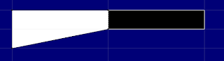
Alternatively, you can change to the Pointer tool (the black arrow) and reshape the rectangle, but notice that this may not work the way you expect. The ‘rectangle’ you created is actually just four points connected by four straight lines, not a ‘rectangle object’ like you might find in PowerPoint or other drawing programs. If you move one corner, the adjoining sides do not slide over so that the shape remains a rectangle. Just that one point moves. In the picture below, the a white and a black rectangle were drawn on the grid. Then one corner of the white rectangle was moved so that it snapped to another point on the grid. See what happened?
This is why I tend to “undo” and re-draw when I make a mistake in FM. It’s generally faster than fixing a mis-drawn object a point at a time.
Now change to the pointer tool and select the rectangle. Copy and paste to create a duplicate. You can do this either via the Edit menu, or using the Ctrl-C and Ctrl-V keyboard shortcuts. Note that the pasted copy will appear exactly over the original, so it isn’t obvious that anything happened. Click and drag the copy over next to the original. It should snap into place next to it on the grid.
To change the second rectangle’s colours, with that rectangle selected go down to the colour palette at the bottom and left-click on black to change the fill to black, then right-click on white to change the line colour to white. Note that if you don’t see a line, check the Line Style toolbar to make sure the style is set to “(solid)”. If the rectangle is not filled with colour, then look at the Fill Style palette on the right to make sure that the “Set:” is “Solid Fill”.
Now you have the basic building blocks for the distance scale. Copy and paste a few more white and black rectangles to build-out the scale to an appropriate length.
Before adding the text, go to the Map menu again and turn *off* the “Snap-to Square Grids” option. Note that, unless you are drawing a classic D&D-style square grid floor-plan map, you will probably *not* want to have the “Snap-To...” feature enabled while you’re drawing your map. It is useful for aligning rectangular objects, but it just gets in the way when you’re trying to draw ‘natural’ looking maps, especially if you are doing continental-scale maps.
I’ll leave the designing and aligning of the text as an exercise for the reader. If you’re obsessive about getting the text aligned just-so (and I’m that anal sometimes) then you can change the grid to a narrower scale that will help you position the text exactly. In general, though, it’s easier just to eyeball it.
Before you go looking for them, I should tell you that FM does not have the object aligning functions you may be used to from Microsoft’s drawing tools. For example, there is no way to select several objects and automatically align their top or bottom edges. I forgot to request this when the list was bombarding poor Ed with feature requests for version 8. Maybe we can ask if it can be added to a later release (they would be very useful for me, at least) or, who knows, it might be possible to create them as plugin functions. Hmm. Going to have to look into that.
Cheers,
Christopher
 A good way to challenge your FM skills is by trying to recreate (or improve) someone else's map. It forces you to solve problems you might otherwise just walk away from as "too hard".
